
TABLE OF CONTENTS
What Changed When We Switched to Plain Text
Why Most Brands Get This Wrong
The Best Places to Use Ugly Emails
Structure of a High-Performing Ugly Email
Practical Writing Rules (Non-Negotiable)


Share via:
Last year, we sent over 1 million emails for different ecommerce brands. What surprised us was that the emails that made the most money were not the most visually appealing ones. They were the plain ones. Mostly text.
We realized that this happened because when someone opens their inbox, they are not in shopping mode. They are not looking for promotions or polished designs. They are not looking for ads; they are simply looking for a simple message they can relate to.
This article will explain why ugly emails generate more sales and how you can create ugly emails.
What Are Ugly Emails?

Ugly emails are emails with mostly text and very little formatting. Sometimes there is an image, but it is raw and unpolished.
These emails do not look like campaigns. They are structured so people can scan their inboxes and decide quickly what to ignore.
Ugly emails work because they do not trigger the feeling of being sold to. They always feel personal.
Below is an example prompt you can use to generate ugly emails:
Act as a senior email marketing strategist and behavioral psychologist.
I want you to explain why ugly, text-heavy, non-designed emails outperform beautifully designed emails in revenue.
Use:
- Consumer psychology
- Pattern interruption
- Inbox behaviour
- Real-world ecommerce examples
- Metrics that matter (conversion rate, revenue per recipient)
Be opinionated, contrarian, and practical. Avoid generic advice. Focus on execution, not theory.
Why Ugly Emails Work

Open your inbox and look at the first five emails you see.
Most of them look the same. Big images. Headline at the top. Button underneath. You already know what they want before you read a single word. So naturally, you skip them.
Sadly, that is what most ecommerce emails look like.
On the otherhand, ugly emails work because they do not look like that:
- They interrupt the pattern: Most inboxes are full of banners, images, and buttons. After a while, everything starts to look the same. But a plain, text-heavy email stands out simply because it looks different
- They bypass ad fatigue: People have learned to ignore anything that looks like marketing. Luckily, ugly emails do not look like ads, so they do not trigger that automatic ignore response
- They feel like a personal message: Short paragraphs, simple language, and minimal formatting make the email feel like it was written to one person rather than thousands
- They feel more honest: When an email is not overly polished, people trust it more. It feels less scripted and less salesy
Instead of pushing an offer immediately, ugly emails gently guide the reader through the message. That makes people more open to taking action later.
Below is an example prompt you can use to generate ugly emails:
Analyze email performance using Klaviyo-style benchmarks.
Explain why:
- Open rate is a vanity metric
- Revenue per recipient is the true north metric
- Conversion rate matters more than CTR
Use examples where ugly emails outperform designed emails by 5x–12x.
What Changed When We Switched to Plain Text

When we started testing ugly emails, open rates were not the main thing we cared about. Revenue was.
The first thing we saw improve was the conversion rate. In several tests, ugly emails converted up to 12 times better than designed emails. It was the same audience, the same offer, and the same list. The only difference was how the email looked and how it read.
Some other things also improved:
- Revenue per recipient: This mattered more than any other metric. Because even when open rates stayed the same or dropped slightly, revenue per recipient increased. That told us the email itself was doing a better job once it was opened
- Email revenue share: For some brands, email was responsible for around 4 percent of total revenue. After moving more campaigns and flows to ugly emails, the email’s share grew to about 37 percent in roughly 45 days. There was absolutely no increase in send volume. We just used better emails
- Campaign performance: Instead of hoping a launch would perform, ugly email campaigns started producing cash on demand. Although there were no massive spikes, the revenue increase we saw was predictable. When we needed to drive sales, we knew what would work
- Flows: Flows built with ugly emails, like welcome and post-purchase, ended up driving close to 50 percent of total email revenue. Once they were set up, they kept working without constant redesign or testing
This is why focusing on open rate alone is misleading. A high open rate does not mean an email generated sales. It only means someone looked at the subject line. However, revenue per recipient tells you if the email actually generated sales.
Below is an example prompt you can use to generate ugly emails:
Explain ugly email performance using behavioural psychology.
Cover:
- Subconscious ad blockers
- Pattern interruption
- Authenticity bias
- Conversational framing
- Resistance reduction
Explain it simply, like you are teaching founders, not marketers.
Why Most Brands Get This Wrong

When a campaign underperforms, your first instinct is usually to change the design. Add a new layout, new colours, and bigger images. Very rarely you do stop and question whether the problem is the format itself.
This happens because you’re most likely treating email as a branding channel rather than a communication channel. You worry so much about how the email looks rather than about how it feels to the person opening it.
This mindset leads to the same mistakes over and over again:
- Brand ego: When people say, “This doesn’t look premium.” What they usually mean is that it does not match the website or brand guidelines. They forget that inbox behaviour is not the same as website behavior. Looking premium does not matter if the email gets ignored
- Agency incentives: Designers and agencies are rewarded for visual output. A good design is easy to show and defend. But a plain text email that outperforms is harder to sell internally, even when the results are visibly
- Legacy marketing thinking: A lot of email strategies are still influenced by magazine ads and flyers. This assumes people will stop and admire design. That assumption does not work in an inbox
Rather than making these mistakes, just remember that the inbox is a private space. It is not a website or a billboard.
Below is an example prompt you can use to generate ugly emails:
Write an ugly email that feels like a 1-to-1 personal message.
Rules:
- No design
- Mostly text
- Short paragraphs
- Conversational tone
- Story first, pitch last
- No hype language
- No corporate words
Audience: Ecommerce founders doing $5–20M
Goal: Drive revenue without discounts
The Best Places to Use Ugly Emails
You don’t need to use ugly emails everywhere.
They work best in specific places, especially where trust and attention matter more than visuals. Some of the best places where you can use ugly emails are:
Welcome Flows
Welcome emails are your first real conversation with a new subscriber. Most brands use heavy design here, trying to “impress” right away. But this never works.
A text only email works better in welcome flows because it feels personal. It is a quick note explaining what the brand stands for and what the subscriber should expect. This also tells the reader that future emails will be easier to read and that you are trustworthy.
This is one of the simplest ways to start using ugly emails vs. beautiful designs and see the difference.
Abandoned Browse Flows
Abandoned cart emails do not need flashy visuals. Why? Because the shopper already saw the product.
The best thing to use here is a short, low design email that reminds the reader why they were interested in the first place. A few lines of email copywriting should convert better than a polished reminder with too many images and buttons.
Post-Purchase Education Flows
At this point, your customers are no longer deciding whether to buy. They are deciding whether to trust your brand again.
Ugly emails work well here because they explain, teach, and guide without selling.
Send a simple follow-up message that answers common questions or shares tips. This feels more genuine than a designed email full of graphics.
Win-Back Flows
Most brands jump straight to using discounts in their win-back emails.
A low design email works better because it feels more honest. It can either:
- Acknowledge a gap
- Explain what changed
- Simply check in on the reader
When written well, these emails bring customers back without offering a discount. It is one of the clearest examples of high-converting emails that don't need design to work.
Founder Story Sequences
Founder story emails perform extremely well as ugly emails. They feel personal by nature.
These emails sound like a message from a person, rather than a company. They build trust pretty fast.
These types of sequences can drive close to half of your total email revenue over time.
Below is an example prompt you can use to generate ugly emails:
Design an A/B test comparing:
Version A: Designed, brand-heavy email
Version B: Ugly, text-based email
Include:
- Hypothesis
- Metrics to track
- Expected behavioural response
- How to interpret results
Example of an Ugly Email
To make this practical, here is a simple example from an ecommerce brand selling lighting and fixtures.
Their audiences are contractors and homeowners. People who are busy, practical, and not interested in marketing. But keep in mind that the email they sent was a campaign, not part of a flow.
The email itself was a text only email. It had no banner, no product grid, and no buttons. Just a subject line, a few short paragraphs, and a simple link at the end.
Here is what happened.
- Open rate was around 68 percent
- Revenue per recipient was about 12 times higher than their usual designed campaigns
- The email generated over $20,000 in revenue from a single send
The offer did not change. The list did not change. Only the format and message did. The reason it worked was simple.
The email started with a story. It talked about a common situation that contractors and homeowners deal with when choosing lighting. It was relatable. It was easy to follow. There was no selling at the beginning.
Instead of pushing products right away, the email entertained first. It shared an observation. It made the reader feel understood. Only after that did it connect the story back to the product.
This approach works well in email marketing for ecommerce because it feels personal. Even though the email was sent to thousands of people, it felt like personalized email marketing. The reader could see themselves in the story.
This is what strong email copywriting does. It does not rush to sell. It builds context first.
In this case, the low design email outperformed what would normally be considered email design best practices.
Below is an example prompt you can use to generate ugly emails:
Audit an ecommerce email flow (welcome, abandoned browse, post-purchase).
Identify where ugly emails should replace designed emails to maximize revenue.
Output:
- Which email to replace
- Why it will work
- Sample ugly email copy
Structure of a High-Performing Ugly Email
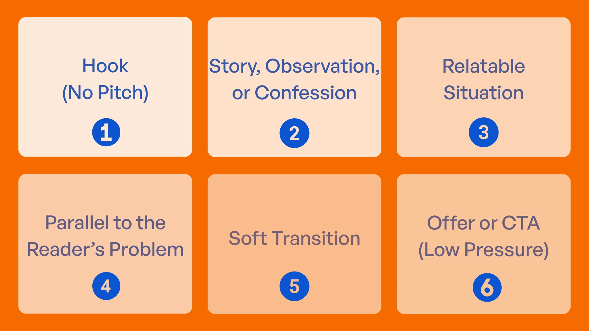
Ugly emails follow a certain structure. This structure works across campaigns, email flows, and even abandoned cart emails because it respects how people read emails.
Below is the structure we’ve seen work consistently:
- Hook (No Pitch)
The first few lines exist for one reason only: to keep the reader from closing the email
There is no product mention here, no offer, and no call to action. It can be a thought, a question, or a simple statement. If the opening sounds like marketing, the email won’t convert
- Story, Observation, or Confession
This might be something you noticed about your customers. A mistake you made. A short behind-the-scenes moment. It should not be dramatic in any way, but it should be true
- Relatable Situation
At this stage, the reader should start nodding as they read your email
You should describe a situation they recognize, a decision they’ve struggled with, or a problem they’ve had before. This works well in email marketing for ecommerce because buyers want to feel understood before they are sold to
- Parallel to the Reader’s Problem
This is subtle. You are not calling them out directly and saying, “This is you.” You are letting them make that connection themselves. This is why text only emails often outperform designed ones. Simply because the reader fills in the gaps
- Soft Transition
Instead of pushing an offer, you ease into it
Use phrases like “this reminded me why we built…” or “that’s what led us to…” This keeps buyer resistance low and works well in low design email campaigns
- Offer or CTA (Low Pressure)
The call to action comes last. It should be optional and fit the message. If the email is really good, people will click without being told to
Below is an example prompt you can use to generate ugly emails:
Create a story-driven ugly email campaign.
Start with:
- A relatable situation
- No product mention for the first 50%
- A soft transition to the offer
- A single CTA at the end
Make it feel like an email a founder would send, not a brand.
Practical Writing Rules (Non-Negotiable)
Do this:
- Write the way you talk: Here’s a rule of thumb, if you wouldn’t say it aloud to another ecommerce owner, don’t write it
- Use short paragraphs: Write one or two lines at most. This makes the email easy to scan
- Leave white space: Empty space is not wasted space. It makes the email less overwhelming
- Be opinionated: Say what you actually think. Neutral emails are easy to ignore. Use clear opinions to hold attention
- Sound imperfect: Adding slightly awkward sentences are fine
Avoid this:
- Do not start with a pitch: If the first thing people see is an offer, most will stop reading
- Do not over-format: Don’t use banners, sections, or heavy styling. Always keep it simple
- Do not over-brand: Logos, colours, and brand elements are less important in the inbox
- Do not add unnecessary images: If an image does not add meaning, remove it
- Do not chase design perfection: Perfect design usually lowers your performance in email
Below is an example prompt you can use to generate ugly emails:
Generate short, contrarian one-liners about email marketing.
Examples:
- "Email is not a beauty contest. It’s a revenue system."
- "If it looks like an ad, it will be ignored."
Generate 10 variations.
Practice Exercises (Very Important)
You can use these exercises across different campaigns, email flows, and even abandoned cart emails.
Exercise 1: Inbox Rewrite
Start with your best-looking email. The one your team was proud of.
Now rewrite it.
- Turn it into plain text
- Remove all images
- Keep the same offer
- Lead with a story or observation instead of a pitch
Send both versions. Do not change timing or audience. Then compare revenue per recipient, not open rate.
Exercise 2: Founder Story Email
Write an email that starts with: “Quick story about us…”
Tell a short, honest story about something that happened in the business. A mistake, a lesson, or a decision. Do not include a call to action until the final part of the email.
Exercise 3: Pattern Interrupt Test
Test subject lines like:
- “This won’t look pretty”
- “No design team approved this”
- “This email is intentionally ugly”
These exercises will help you see how people respond to ugly emails. And the truth is, once you’ve seen it, it becomes very hard to justify going back to overly designed campaigns.
Below is an example prompt you can use to generate ugly emails:
Explain a counterintuitive email marketing insight that contradicts modern design trends. Structure it like a presentation:
1. The belief everyone has
2. Why it’s wrong
3. The data that proves it
4. The psychology behind it
5. Practical takeaways
6. How to apply it today

.svg)

.avif)


.svg)


