TABLE OF CONTENTS
Design fundamentals (visual appeal, layout, colour scheme)
Use visual hierarchy to lead the eye
Balance white space and visuals
Mobile Optimization and Page Speed
Content Strategy Focusing on Value-First Messaging
Psychological Triggers: Urgency, Scarcity, Trust, and Social Proof
Use of Countdown Timers and Exclusive Bundle Offers
Technical Considerations: Load Times and Seamless Checkout


Share via:
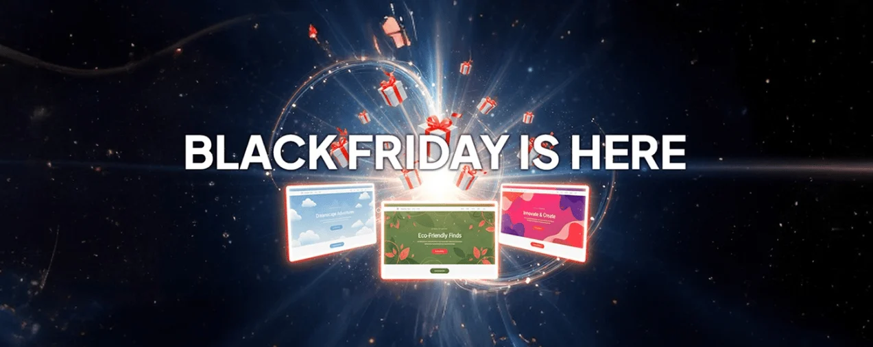
Black Friday and Cyber Monday (BFCM) are just around the corner, and the question everyone is asking is: How do I encourage people to buy my products?
While it’s true that Black Friday and Cyber Monday bring huge traffic spikes, they also bring high bounce rates. Many shoppers click an ad, open a landing page, and leave without buying. The reason isn’t always your offer. Most of the time, it’s your page.
A BFCM landing page should make it easy for people to buy. It should be clear, fast, and persuasive. If your page isn’t optimized for that, you'll lose both attention and sales very quickly.
In this article, we’ll examine how to design a landing page that keeps visitors engaged and encourages them to proceed to checkout.
What Is a BFCM Landing Page ?

A BFCM landing page is a page specifically created for your Black Friday and Cyber Monday sales promotions. It’s different from your homepage because it focuses on one goal: turning your visitors into buyers.
Instead of sending ad traffic to your homepage or category page, it gives shoppers a single message: “Here’s the offer. Here’s why it’s worth it. And here’s how to get it now.”
During BFCM, the attention span of your potential customers is very short. Therefore, you need to simplify the customer journey and remove distractions, allowing you to capture the surge in demand instead of losing it to comparison shopping.
Let’s go right into how you can optimize your BFCM landing page to reduce drop-offs.
Design fundamentals (visual appeal, layout, colour scheme)
Design is more than an aesthetic appeal. It’s how it guides your shopper’s eyes, emotions, and decisions.
Here are some ways to improve your landing page design:
Start with a clear structure
Use a hero section at the top with your offer in bold text and one strong product image or video. If you sell skincare, show someone actually applying the product. If it’s a supplement, highlight the lifestyle benefits such as increased energy, improved focus, or enhanced confidence.
Keep everything above the fold simple:
- Your headline
- Offer details
- Main CTA button (“Shop Now,” “Claim Your Deal”)
Use visual hierarchy to lead the eye
Visitors don’t read web pages in straight lines. Their eyes follow natural patterns. The two most common are called the F-pattern and the Z-pattern.
In an F-pattern, people scan across the top of the page first (the headline area), then move down the left side, occasionally glancing across again, forming the shape of the letter “F.” This pattern usually appears on pages with lots of text or lists, like blog posts or product catalogues.
In a Z-pattern, the eyes move from the top left corner across to the right, then diagonally down to the lower left, and across again, creating a “Z” shape. This works best for visual layouts, such as landing pages, where the goal is to guide someone from the headline to the main image to the call-to-action.
When designing your BFCM landing page, place your most important elements, such as the headline, key visual, and CTA button, along these paths. It helps visitors naturally find your call-to-action buttons faster.
Keep your colours intentional
Colours carry emotion:
- Red creates urgency
- Black signals exclusivity
- Green is reassuring
But you have to tread carefully, because throwing in too many bold colours can distract rather than convert. It’s recommended that you stick to your brand palette and use accent colours on your “Shop Now” or “Add to Cart” button.
For example, if your brand uses neutral tones, consider adding a bright accent colour (such as orange or yellow) to your CTAs to make them stand out against the background. During BFCM, dark-themed designs (black, navy, charcoal) paired with vibrant accents can make deals feel premium and time-sensitive.
The rule: choose two to three primary colours and stay consistent across every section of your landing page.
Balance white space and visuals
A crowded page with banners, flashing GIFs, and overlapping images can overwhelm shoppers and make navigation harder. Instead of doing this, structure your layout so each headline, product image, and CTA has relevant white spaces.
Use these white spaces to guide attention down the page, from the headline to the offer, then to the CTA button. This flow encourages scrolling and prevents mental fatigue, which is very important on mobile devices.
Use familiar imagery
BFCM is not the time to reinvent your brand’s look. Stick with imagery that feels familiar to your existing audience. Use real product photos or lifestyle images that show the product in use, rather than stock photos.
For example, a fitness brand could show real people using their equipment at home, while a beauty brand could highlight before-and-after results instead of flat product shots. These visuals connect emotionally and build credibility.
And don’t forget image hierarchy, your hero image should clearly feature the main offer or bestselling product, while secondary images can support different use cases or variations. Continually optimize your images for speed; a beautiful photo that loads slowly is still going to affect your conversion.
Mobile Optimization and Page Speed
Nearly 70% of Black Friday traffic now comes from mobile devices, which means your page must load quickly and look great on every screen.
To achieve this, start by running a speed test using tools like Google PageSpeed Insights or GTmetrix. These tools highlight what’s slowing down your page, such as oversized images, unused JavaScript, or excessive tracking scripts.
Here’s how you can fix the most common issues:
- Use formats like WebP and tools like ImageOptim to reduce file size without losing quality
- Keep motion subtle and use short loops. Heavy files can delay load times
- If you’re on Shopify or WooCommerce, choose themes designed for mobile-first performance
- Consider a content delivery network (CDN) like Cloudflare to load assets faster for global users
- Replace large dropdowns with compact menus. Your shopper should reach any section with one or two taps
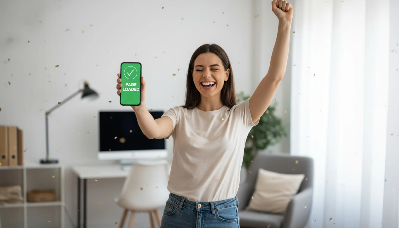
If your page takes longer than three seconds to load, you’ll lose up to half your potential buyers. So make sure you have a fast mobile site that directly improves conversions during your busiest sales weekend.
Content Strategy Focusing on Value-First Messaging
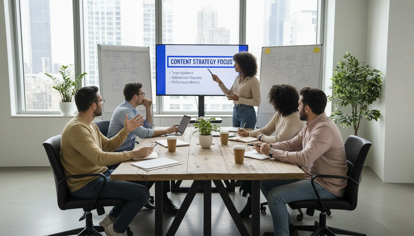
Every brand will say “Up to 50% Off,” but that’s not enough to stand out. Your shoppers want to know why your product is worth their attention. Therefore, your content should answer one simple question for the shopper: “Why should I care?”
You can start by framing your copy around value, rather than price. For example, if you sell heated blankets, write: “Stay warm all winter and save 40% this weekend only.”
Break your message into three layers:
1. Headline: State the main offer and benefit
2. Subheadline: Add context or timeframe (“Ends Monday,” “Exclusive for subscribers”)
3. Body copy: Reinforce the value. Keep it short, clear, and friendly
Use proof throughout your page. This should include customer photos, short testimonials, and simple review stats (like “Rated 4.9/5 by 3,000 customers”) to turn your shoppers' skepticism into trust
Add a main CTA above the fold, one in the middle, and one at the end of the page. This way, shoppers never have to scroll too far to act.
Also, focus on speaking like a human. Write like you’re explaining your offer to a friend. This is because simple language always converts better because it builds a connection.
Psychological Triggers: Urgency, Scarcity, Trust, and Social Proof

The worst thing to do during BFCM is to pressure people. You should focus on giving people the right nudge at the right moment. The important thing is to use certain triggers authentically, without manipulation.
Examples of such triggers include:
- Urgency: Add deadlines using phrases like “Ends Tonight” or “Only 24 Hours Left” to push action. Combine this with a countdown timer at the top or bottom of your page so the clock is always visible
- Scarcity: If only 100 units remain, say so. You can also use small alerts like “Selling Fast” or “Only 3 Left in Stock.” These reminders make the offer feel exclusive
- Trust: Add visible trust badges like “Secure Checkout,” “Free Returns,” or “Money-Back Guarantee.” Include customer service links and clear policies so shoppers don’t second-guess
- Social Proof: Use short quotes or screenshots from verified reviews. If influencers or media outlets have featured your brand, place their logos near the CTA for credibility.
Here’s an example layout you can use:
- Headline: “60% Off All Organic Candles, This Weekend Only”
- Review line: “Loved by 10,000+ happy customers”
- CTA: “Shop the Collection”
- Trust section: “Free Shipping | Secure Payment | Easy Returns”
Each layer above reinforces confidence, and it is confidence that converts.
Use of Countdown Timers and Exclusive Bundle Offers

Countdown timers are one of the simplest ways to remind people that time is running out. Place your timer near the top of your landing page, ideally just below your headline or CTA. Keep it visible as they scroll.
Make sure the timer reflects your actual sale window. Don’t reset it artificially. If your sale ends in 48 hours, the timer should say “Sale Ends in 1 Day 23 Hours 15 Minutes.”
Add a second timer inside your cart drawer or checkout page. Sometimes, people need that final little push to complete a purchase.
Exclusive bundle offers are another good CRO strategy. Instead of heavily discounting everything, combine related products into high-value bundles. For example:
- “Holiday Glow Kit” (includes cleanser, serum, and moisturizer)
- “Ultimate Fitness Bundle” (yoga mat + towel + water bottle)
Bundles make customers feel they’re getting more value for the same effort. They also increase average order value without hurting your margins.
If you offer free shipping above a certain order amount, show a progress bar: “Only $15 away from free shipping.” This reduces hesitation.
Technical Considerations: Load Times and Seamless Checkout

The best landing pages have a strong technical setup. Even small errors, like a broken button, a slow script, or a missing tag, can dramatically reduce your sales.
You can reduce technical errors by:
- Using tools like Google Lighthouse or GTmetrix to spot what’s slowing your page down. Compress all large files, remove extra plugins, and make sure your hosting plan can handle high traffic spikes during BFCM
- Setting up caching and CDNs to distribute your content across multiple servers so visitors can load pages from the closest location. It reduces delays and maintains stable performance
- Making sure your pixels, tags, and conversions are functioning correctly. You want every click and sale recorded accurately
- Testing every step manually, including adding a product to cart, going through checkout, and completing a payment on both mobile and desktop. Look for small friction points like slow fields, unclear forms, missing autofill, or confusing copy
If something makes you pause, it will likely cause your customers to leave.
Clear and Simplified Checkout Process

Now that you’ve found out how to win their attention, it’s time to keep their trust. You can do this by:
- Keeping a simple layout: Show everything on one page if possible. Shoppers should see their order summary, delivery options, and total cost upfront
- Offering guest checkout: Don’t force new users to create an account. You can always capture their email later
- Reducing form fields: Only ask for what’s necessary. Also, including autofill and saved address options helps speed up repeat purchases
- Displaying reassurance: Add security icons, free return notes, and small text like “Your data is 100% secure.” These small signals reduce last-minute anxiety
- Multiple payment methods: Include PayPal, Shop Pay, Apple Pay, and credit card options so your shoppers can have a flexible payment experience
Continue to test your checkout flow regularly, even during sales. When you have a clean, fast, and trustworthy checkout process, you’ll have more sales.
Wrapping Up
A BFCM landing page is your most important sales tool during Black Friday and Cyber Monday. It’s where people decide if your offer is worth their time.
As previously discussed, keep your design clean, your copy focused on value, and your checkout simple. Add trust signals and honest urgency. Test your page early and continue to track performance throughout the sale.
Frequently Asked Questions (FAQs)
- What is a good CTR for a landing page?
A well-optimized landing page usually has an average conversion rate of around 6.6%. The rate depends on your traffic source and the clarity of your offer.
- Do low-stock labels really help?
Yes. Low-stock labels help your customers make faster purchasing decisions. Just make sure they’re real.
- What are some key Black Friday SEO strategies?
Update your meta titles and descriptions with Black Friday keywords. Link to your BFCM page early. Test speed and mobile layout before the sale starts.
- What are three pros and cons of Black Friday?
Pros: High sales volume, more visibility, and new customers.
Cons: Lower margins, higher ad spend, and more competition
- How to maximize Black Friday sales?
Prepare early, promote across email and social media, and test your landing page and checkout flow before launch.
- How does Black Friday benefit businesses?
It brings new customers and more exposure. Even with lower margins, it helps brands grow awareness and repeat sales after the season ends.

.svg)
.avif)


.svg)


