TABLE OF CONTENTS
The Science Behind Colour Psychology
How Colours Influence Buying Behaviour on Amazon
Colour Strategies by Product Category
Colour, Brand Loyalty, and Impulse Buying
Seasonal and Demographic Colour Insights
Colour Psychology for Call-to-Actions (CTA Buttons)


Share via:
Think about the last time you clicked on an Amazon listing. Was it the headline that caught your eye, or the colour?
You might have realized it or not, but the colours in that image, the tone of the packaging, and even the background shade nudged your brain toward a decision, and that is colour psychology.
Colour psychology is the science of how colour triggers emotion, influences perception, and drives buying behaviour. According to a study, 85% of the reasons why people buy products are because of colour.
How does this affect you as an ecommerce business owner? As Amazon becomes more visual and competitive, mastering colour psychology for Amazon listings is important if you want to stand out and convert more.
In this article, we’ll explore how colour affects your audience, your brand story, and ultimately, your sales.
Let’s get right in.
The Science Behind Colour Psychology

Colour is a type of data that your brain processes instantly.
When Amazon shoppers scroll through dozens of options, their brains are making split-second judgments, even before they’ve read a word. These judgements create buying decisions that happen subconsciously, and colour plays a huge role in that first impression.
Here’s how common colours can influence perception:
These reactions come from cultural and psychological associations built over time. So, the better you match your product’s message to the colour’s emotion, the stronger your listing will perform.
But how exactly does colour influence buying behaviour? Keep reading to find out.
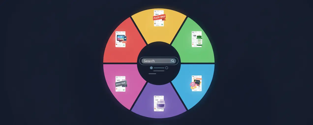
How Colours Influence Buying Behaviour on Amazon
Your colour choice shapes perception, and perception, in turn, drives sales.
This means that when you choose colours that match your audience’s emotions, you’re speaking their subconscious language. That’s the psychology of colours in advertising and marketing, and it’s the reason major brands invest so heavily in visual identity.
For example:
- A bright yellow listing can grab attention, but may feel cheap if overused
- A deep blue layout signals reliability, which is why so many tech and healthcare brands use it
- A bold red offer badge creates urgency (“only 5 left in stock!”) and increases conversions
This is why understanding colour, emotion, and buying behaviour helps you create listings that sell.
Let’s now explore the best colour strategies by product category.
Colour Strategies by Product Category
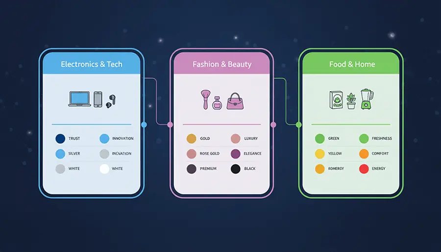
Different products require different colour approaches. The reason for this is that what attracts a parent shopping for baby clothes won’t appeal to someone browsing for gym equipment.
Here’s how to create your colour psychology in a way that aligns with your product type:
- Health and Wellness: Stick with green, blue, and white. These colours communicate purity and reliability. They work best for supplements, skincare, or health accessories
- Technology and Electronics: Choose black, gray, or blue. Clean, neutral tones make products look modern and professional
- Fashion and Beauty: Use pink, purple, gold, or black. These colours evoke a sense of creativity and luxury. They’re strong fits for clothing, cosmetics, and jewelry
- Toys and Kids’ Products: Go for bright red, orange, and yellow. These shades attract attention and reflect energy and fun
- Eco-Friendly and Natural Products: Use earth tones and muted greens. They feel natural and environmentally conscious
Contrast and Visibility
Because most shoppers scroll on mobile, small differences in brightness or saturation can decide whether your image stops the scroll.
We’ve found that high-contrast images capture attention, whereas washed-out ones tend to fade into the background.
Here are a few simple rules to keep in mind:
- Use a white background (Amazon requires it), but let your product colour stand out boldly
- Test different shades and angles
- Keep your brand colour consistency across listing images, A+ content, and packaging to strengthen recognition
Keep in mind that contrast is important because it helps your listing look professional and trustworthy, especially on mobile screens where minor differences matter.
A/B Testing Colours on Amazon
Now, how can you tell if your colour choices are working? Through A/B testing.
Amazon now makes it easier to test different image colours, button designs, and headlines through tools like Manage Your Experiments.
You can test one variable at a time, such as background colour, accent colour, or product packaging.
For example:
- Test a white vs. light gray background for your main image
- Try blue vs. orange buttons in your A+ content
- Compare two packaging colour versions for engagement and conversion
A/B testing colours on Amazon helps you rely on data to find what resonates best with your audience.
Colour, Brand Loyalty, and Impulse Buying

The funny thing about colours is that once you establish consistent colours, your customers start recognizing your brand instantly, just like they do with Coca-Cola’s red or Tiffany’s blue.
On Amazon, trust drives conversions. When shoppers spot your familiar colour palette, they feel comfortable repurchasing from you.
At the same time, your strategic colour choices can trigger impulse buying behaviour, especially when you pair urgency-based shades like red or orange with limited-time offers.
In short, colour consistency builds familiarity, and familiarity builds trust.
Seasonal and Demographic Colour Insights
Colours change with seasons, culture, and audience, so you must also learn to change when necessary. For instance:
- For Spring/Summer: Use bright, airy shades (yellow, turquoise, coral)
- For Fall/Winter: Use deep tones (burgundy, navy, forest green)
- For younger audiences, use energetic, saturated colours
- For older demographics, use clean, balanced tones with strong contrast
If you sell globally, be mindful of cultural meanings too.
For example, red signals luck and prosperity in China but can symbolize danger elsewhere. White may represent purity in Western cultures, but mourning in some Eastern regions.
These colour interpretations matter when you’re creating Amazon listings for international markets.
Accessibility and Inclusivity
Good design is inclusive.
Roughly 8% of men and 0.5% of women have some form of colour blindness. This means that millions of Amazon shoppers might not see your colour choices the way you intended.
So, to make your visuals more accessible:
- Use high-contrast combinations (dark text on light backgrounds or vice versa)
- Don’t rely on colour alone to convey meaning; combine colour with icons or labels
- Test your listing images with a colour blindness simulator before uploading
When you create inclusive designs, you expand your reach and build a better user experience for all your customers.
Colour Psychology for Call-to-Actions (CTA Buttons)
Even the tiniest design choice, like a “Buy Now” button colour, can affect your conversion rates.
That’s why understanding colour psychology for marketing isn’t just limited to imagery; it shapes how customers interact with your entire brand.
Use:
- Red or orange CTA buttons to convey urgency
- Green to signal progress (“Go,” “Next,” “Add to Cart”)
- Blue for checkout screens
The important thing is contrast. Your CTA colour should stand out from the rest of your listing layout.
A good rule of thumb: one main brand colour, one accent colour, and one neutral tone.
Packaging Colours That Meet Amazon Guidelines
It’s true that Amazon’s packaging guidelines emphasize simplicity and transparent labelling, but you still have room to be creative within those limits.
A few tips:
- Stick to non-reflective, scannable surfaces for barcodes
- Keep text legible against your chosen background colour
- Use packaging tones that match your brand’s online visuals
When the colour, material, and branding align, your product feels professional.
Conclusion

Colour is one of the fastest ways to communicate emotion, value, and trust.
It can catch attention, signal quality, and influence whether someone clicks or scrolls past.
To make colour work for your listings:
- Match colour to your audience and category
- Keep contrast strong and visuals consistent
- Test often, rely on data, not assumptions
- Consider accessibility and cultural meaning
If you want your Amazon listings to perform in 2025, stop treating colour as decoration and start using it as a conversion driver. Because in the end, colour doesn’t just make people see your product. It evokes a feeling in them.

.svg)

.avif)


.svg)


