
TABLE OF CONTENTS
Why Is Mobile Optimization Important?
- It Directly Affects Your SEO Rankings
- It Reduces Bounce Rate
- It Boosts User Experience and Conversion
- It Supports Brand Credibility
How To Optimize Your Website for Mobile
- Use Responsive Web Design
- Prioritize Site Speed
- Simplify Navigation
- Optimize Content for Readability
- Rethink Pop-Ups and Forms
- Optimize for Touch
Tools and Best Practices for Testing Mobile Optimization


Share via:
Pull up your website on your phone right now. Does it load fast? Is the text readable without zooming in? Do the buttons fit your thumb?
If the answer to any of those is “not really” or “no”, then you’re losing visitors.
This is why mobile optimization is important. It involves making sure your site looks good, loads quickly, and functions smoothly on any mobile device.
More than 60% of online traffic originates from mobile devices, and search engines tend to rank mobile-friendly sites higher. So if your site doesn’t perform well on mobile, you’re not just frustrating users, you’re also pushing away sales.
In this article, we’ll break down what mobile optimization actually means, why it matters, and how to do it right.
Let’s get right in.
What Is Mobile Optimization?
Mobile optimization is the process of designing and improving a website so it performs well on smartphones and tablets.
It’s not just about shrinking your desktop site to fit a smaller screen; it’s about re-thinking the entire experience for mobile users.
A mobile-optimized site should:
- Load quickly, even on slower connections
- Adjust automatically to different screen sizes (responsive web design)
- Display readable text and properly sized images
- Offer simple navigation and clickable elements
- Keep all content accessible without endless scrolling or zooming
In other words, it’s making your site feel like it was built for a phone, not just resized for one.
Why Is Mobile Optimization Important?
1. It Directly Affects Your SEO Rankings
Since the introduction of Mobile-First Indexing, Google ranks websites based on their mobile versions first.
If your mobile site loads poorly or displays errors, your SEO rankings will suffer, even if your desktop site appears flawless.
Google’s Core Web Vitals measures:
- Loading speed
- Interactivity
- Layout stability
2. It Reduces Bounce Rate
Studies show that if a mobile page takes longer than 3 seconds to load, over half of visitors will leave.
That’s why Core Web Vitals is important. They measure speed, responsiveness, and layout stability.
By improving mobile site speed optimization, you reduce bounce rate and increase engagement time.
3. It Boosts User Experience and Conversion
Mobile visitors bounce quicker than desktop users. This is because a mobile-friendly site makes it easier for visitors to browse, read, and complete purchases.
Simple layouts, fast-loading visuals, and easy-to-tap buttons lead to more conversions.
In e-commerce, even small usability improvements can make a noticeable difference in sales.
When you improve loading time and usability, you get a reduced bounce rate, longer browsing sessions, and more sales.
4. It Supports Brand Credibility
A mobile-friendly website shows professionalism.
If your site looks outdated or broken on mobile, shoppers assume the same about your business. In contrast, when users see a clean layout and fast-loading visuals, they instantly trust your brand more.
Consistency across devices helps build trust and brand authority.
How To Optimize Your Website for Mobile
Here’s a step-by-step approach to improving mobile usability and performance.
1. Use Responsive Web Design
A responsive design automatically adjusts your layout for any screen size, no matter the device.
If you’re using Shopify, WordPress, or Webflow, most modern themes already include this feature.
To test responsiveness, resize your browser window. If text or images are cut off, your layout isn’t truly responsive.
Tip: Avoid fixed-width layouts. They look fine on desktop but break easily on smaller screens.
2. Prioritize Site Speed
Speed is everything on mobile.
Here’s how to improve mobile site speed optimization:
- Compress and optimize images and videos (use WebP for images, MP4 for videos)
- Enable lazy loading so visuals only appear when users scroll to them
- Use a content delivery network (CDN) to load assets from nearby servers
- Minimize scripts and remove unused plugins
For instance, if your homepage takes 6 seconds to load and each second costs 10% of users, you could be losing half your potential customers, before they even see your product.
3. Simplify Navigation
Mobile users don’t want to dig through dropdown menus. So here’s how you can keep a simple navigation:
- Keep your menus short and clear
- Avoid drop-downs that hide half the page
- Use a “hamburger” menu or sticky navigation bar for easier access
- Make buttons large enough for thumbs and place key actions (like “Add to Cart” or “Contact”) where users naturally look, such as the center or bottom of the screen.
Practical check: If someone can’t reach your bestsellers in two taps, your navigation needs work.
4. Optimize Content for Readability
Mobile screens are small, so long paragraphs and tiny fonts won’t work. Instead, use short sentences, plenty of spacing, and headers that guide readers through your page.
Stick with a readable font size (16px or higher) and clear contrast between text and background.
If your site includes blogs or articles, ensure that the formatting scales smoothly and the text reflows naturally when switching from landscape to portrait orientation.
5. Rethink Pop-Ups and Forms
What works on desktop can feel aggressive on mobile. For instance, large pop-ups that block the screen can frustrate users and hurt your SEO rankings (Google penalizes intrusive interstitials).
Here’s what you can do to avoid this:
- For sign-ups or promos, use small slide-ins or time delays
- For forms, keep it short: name, email, and one key field are usually enough
6. Optimize for Touch
On mobile, people tap with thumbs, not cursors. This means that your buttons need enough spacing and size (minimum 48×48 pixels recommended).
We recommend that you:
- Space out clickable elements to prevent accidental clicks
- Avoid hover-based menus since they don’t work on touchscreens
- Test key features, such as forms, chat buttons, and checkout pages, on multiple devices
Test your site by navigating only with your thumb. If you struggle to tap or accidentally click the wrong link, it’s not mobile-friendly yet.
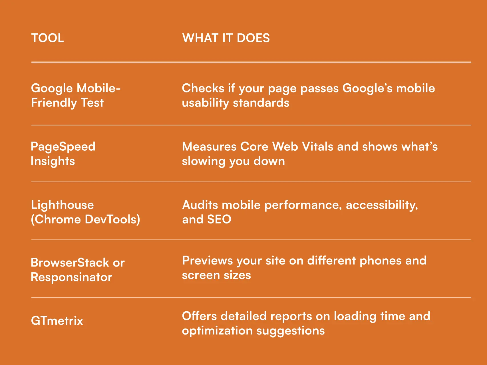
Tools and Best Practices for Testing Mobile Optimization
Several mobile optimization tools can help you test performance and identify areas for improvement. Some of these tools include:
Mobile Optimization Best Practices Checklist
Here’s a quick mobile optimization checklist to keep handy:
✅ Use responsive web design
✅ Keep page load under 3 seconds
✅ Optimize images and videos
✅ Simplify navigation and menus
✅ Avoid intrusive pop-ups
✅ Test buttons and forms for touchscreens
✅ Use readable fonts and strong colour contrast
✅ Check every page on multiple devices
✅ Monitor Core Web Vitals regularly
Checking these boxes ensures that both users and search engines are satisfied.
Wrapping Up
In this day and age, mobile optimization is no longer an option, but a fundamental part of web design and SEO.
A well-optimized mobile site improves user experience, boosts visibility, and increases conversions.
The good news is that you don’t need a complete redesign of your website. Start with minor improvements, speed, layout, navigation, and regular testing.
In essence, mobile optimization is about removing friction so that your customers can get what they came for quickly.
FAQs
- What is poor mobile optimization?
Poor mobile optimization means a site loads slowly, has unreadable text, misplaced buttons, or requires zooming and scrolling to navigate. It frustrates users and increases bounce rates.
- How does mobile optimization affect SEO rankings?
Google prioritizes mobile-friendly sites. A poorly optimized site can experience a drop in rankings, lose organic traffic, and perform worse in paid advertisements.
- What’s the difference between responsive and adaptive design?
Responsive design fluidly adjusts to any screen size. Adaptive design uses fixed layouts for specific devices. Responsive is more flexible and future-proof.
- How can I check if my website is mobile-optimized?
Run your site through Google’s Mobile-Friendly Test or PageSpeed Insights. You can also open it on several devices to check manually for spacing or layout issues.

.svg)

.avif)


.svg)


